Interface design
Research, prototypes and wording for screens where misunderstanding costs money.
Research with real readers
We interview and observe the people who will use the software, including those who find numbers difficult. We ask them to explain what a screen means in their own words. Their explanations reveal far more than preference surveys.
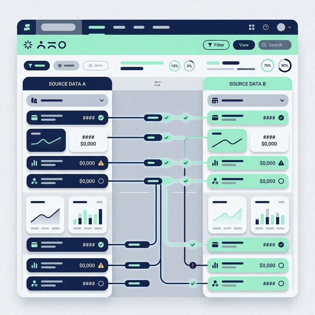
Rules for figures
| Alignment | Tabular digits, right-aligned on the decimal point. |
|---|---|
| Negatives | A minus sign and a word such as "owed" or "paid out", never colour alone. |
| Dates | Labelled as transaction, posting or due date. Day, month name, year. |
| Totals | Each one opens a list of its parts. |
| Charges | Shown before commitment, in the same size as the main figure. |
Words
We write interface copy at the reading level of the broadest audience, explain unavoidable terms the first time they appear, and test the wording as carefully as the layout. The plain-English checker in our library is a small public version of a habit we apply to every screen.
Accessibility and vulnerability
WCAG 2.2 AA is our working baseline. Beyond it, we design for stress: timeouts with warnings, undo where possible, confirmation that repeats the amount and recipient in words, and no manipulative urgency. How your firm supports customers in vulnerable circumstances is a policy decision for you; we make the screens support it.
Prototypes as briefing documents
A clickable prototype is often the clearest way to brief your compliance adviser, your board or your investors. We build prototypes that look real but are clearly labelled as such, using fictional data.